
Free UX Research Report Template + How to Automate with AI
Download our free template, use it to structure your next study, then learn how to let Lumor's AI Doc Report fill it for you — automatically, from live survey data.
A research report is the last mile of your study. You've written the survey, recruited participants, and collected 200+ responses. The insight is in the data. And then it dies — in a Google Doc that nobody opens, a spreadsheet that only you can read, or a presentation that took 4 hours to build and was outdated by the time you sent it.
This article gives you two things: a free template that structures your report the right way, and a walkthrough of how Lumor's AI Doc Report fills it automatically so you can spend that 4 hours doing something that actually requires your judgment.
Why most research reports fail stakeholders
The average research report is written for researchers, not for the people who need to act on it. It leads with methodology. It buries the headline finding in section 4. It includes every data point because the researcher is reluctant to discard work. And it uses language — “statistically significant”, “p-value”, “n=47 subset” — that creates distance between the reader and the decision.
Stakeholders — PMs, designers, founders, marketing leads — don't need comprehensiveness. They need clarity. They need to know, in the first 60 seconds of reading, what you found, what it means, and what you think they should do about it.
The template below is structured around that reading behaviour. The most important content comes first. Supporting evidence comes after. Methodology and raw data are at the end, for those who need to verify — not for those who need to decide.
Structure your report the way a newspaper structures its front page — the headline, then the lede, then the supporting detail. Not the other way around. Your stakeholders read like journalists scan headlines, not like academics read abstracts.
Download the free template
Lumor UX Research Report Template
A ready-to-use Google Doc template structured for stakeholder clarity. Eight sections, pre-written headings, placeholder guidance on every section, and an AI-ready layout that Lumor's Doc Report can auto-populate. 8 sections · pre-written placeholders · AI-compatible · Google Doc.
No email required. Word document opens immediately.
What each section does and why it's there
The template has eight sections. Here's what each one does — and the specific mistake it's designed to prevent.
3 bullet points. Top finding, top implication, recommended action. This is the only section most stakeholders will read in full. Everything else supports it.
What were you trying to find out and why? One paragraph. Prevents the report from being read in isolation — gives stakeholders the “why this study” context before the “what we found”.
How did you run the study? Who responded? Brief and factual. This section is for credibility and reproducibility — not the main event. Keep it under 150 words.
One finding per sub-section. Each finding is a declarative statement — not a chart description. Chart or data point follows the finding statement, not the other way around. This is the inversion that most reports get wrong.
Open-text responses grouped into named themes. 3–5 themes maximum. Each theme gets a name, a 1-sentence description, and 2 representative verbatim quotes.
Where do different audience groups diverge? The most interesting findings are often in the deltas — not the averages. This surfaces the “but for this group...” insight that changes product decisions.
3 specific, actionable recommendations written in plain language. Each one references the finding it comes from. Avoids the generic “do more research” recommendation that every report ends with.
Everything that belongs in the report for completeness but not for the main reading experience. Full question list, response distributions, methodology details, survey link. Optional.
Filling it manually vs with AI
There are two ways to use this template. The first is manual — you fill in each section yourself, pulling data from your survey tool and writing the findings and recommendations from scratch. The second is automated — you run your survey in Lumor and let the AI Doc Report populate the template for you.
Manual workflow
- Export CSV from survey tool
- Calculate percentages manually
- Copy-paste data into the template section by section
- Write findings and recommendations from a blank page
- Format charts, resize images, align layout
- Search open-text responses to find good quotes
- Identify themes in qualitative data by hand
- Total: 3–5 hours for 200 responses
AI Doc Report workflow
- Close survey in Lumor
- Click Studio → Doc Report
- AI reads all responses and identifies key patterns
- AI writes finding statements and recommendations
- AI surfaces top verbatim quotes from open-text
- AI groups themes from qualitative responses
- Review, edit, add your editorial layer, export
- Total: under 15 minutes
Use the manual template if you're analysing data from a tool other than Lumor, or if you prefer to write the report yourself first and use AI as a review pass. Use the AI Doc Report if you're working in Lumor — it's the same template structure, populated automatically. Either way, your editorial judgment on findings and recommendations is irreplaceable.
Step-by-step: the AI Doc Report workflow
If you're running your survey in Lumor, here's exactly how the AI Doc Report workflow works — from survey close to finished document.
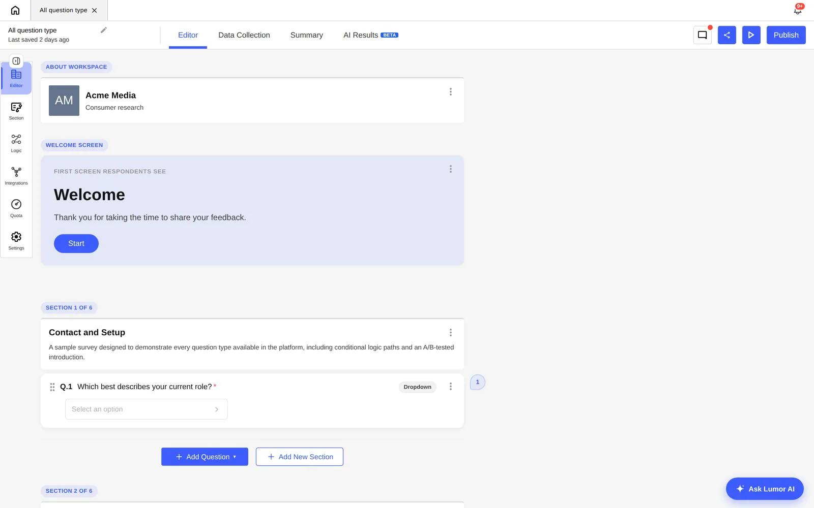
In the Data Collection tab, toggle your collector offline. Once closed, responses are locked and the AI can process the full dataset without incomplete responses skewing the analysis.
Navigate to the Result tab on your survey. On the right you'll see the Studio panel. Select “Doc Report” — it produces a formatted written document, where “Slides” produces a presentation deck.
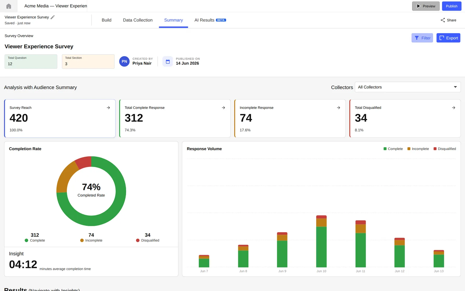
Lumor's AI reads every response — quantitative and qualitative. It calculates distributions, identifies the top statistical patterns, groups open-text themes, and selects the most representative verbatim quotes. This takes 60–120 seconds.
The output mirrors the template structure above. Read through once with your stakeholder's eye. Is every finding a declarative statement? Is the executive summary tight?
The AI handles production. You handle judgment. Edit the Recommendations to reflect your team's context. Add the “so what for our sprint” note. Flag any finding where the sample size is too small to be conclusive.
Download as a formatted PDF for email, or share a live link directly from Lumor. Team members with view access can read the report without downloading anything.
5 tips for a report stakeholders actually read
Whether you're using the manual template or the AI Doc Report, these five habits separate research communication that changes decisions from research communication that gets archived.
- Lead with the finding, not the method. Move methodology to the back. Put your top finding in the first 100 words.
- Use a declarative headline for every finding. “Section 3: Payment step data” is a label. “Users abandon at payment 3× more on mobile than desktop” is a finding.
- Include exactly one verbatim quote per finding. One well-chosen quote does more work than 10 data points. It makes the number human.
- Write your recommendations as actions, not observations. “Users find onboarding confusing” is an observation. “Remove step 3 and test a 2-step alternative” is a recommendation.
- State what this study does not answer. One sentence sets the right expectations and pre-empts the meeting question that would have derailed the conversation.
Key takeaways
- Structure your report for the reader who will act on it, not the researcher who wrote it. Decision-makers read like journalists, not academics.
- The eight-section template is ordered by stakeholder reading priority — executive summary first, raw data last.
- AI Doc Report in Lumor produces the same structure automatically. Your job is the editorial layer: context, judgment, and the “so what for our team” annotation.
- The gap between “data in” and “report shared” should be measured in minutes, not days.